An Explanation for the Icons #ios7

So I recently saw the movie Jobs. I thought it was really accurate, although Steve acted like a complete asshole ALL THROUGH the movie, and only served to make the viewer wonder if Steve was the ANTAGONIST or the PROTAGONIST.

Sadly, that may have been the point. And thus no one smashed into the walls of the world, and innovation ground to a halt because of the human condition. You’re welcome.

BUT…I had an epiphany after watching that…about the icons in iOS 7, and why they’re so horribly NEON.

In the movie, Jobs stressed the fact that everything Apple had to be an “extension of the user”. This means that, using downloading a movie from iCloud as an example, the user dosen’t have to worry about what port to connect to or what protocol to use or even what server to download from or whether to limit the kilobytes per second. iCloud figures all that out automatically, the user dosen’t have to do jack…in the box, they just have to tap with their finger. As intuitive as moving your arm.

Now from iOS 1-6, Jobs had the reigns, and focused on “skeuomorphism”, the act of designing UI to exactly mimic (ascetically, and this includes animations) a real world object that is for the same purpose as the UI implies, for example, the Notes app looked like a real-world notepad.

Now Steve is dead, and Jony Ive has taken the reigns. And Jony is done with skeuomorphism. In fact he dosen’t want any textures on most of his design, the icons will now only be an “extension of the user”.

You might have figured it out already, but for those who haven’t…

In-app UIs are really easy. What’s a color that’s easy to see? White. Slap that around like a child. Blue text has high contrast to white and it’s lovely, put that in too. Everything else needs high contrast and bright colors, we have ourselves a pretty peachy peach that we pick or whatever.

Home screen icons? Just put that to our market analysts–

Nah, I’m kidding. That seems to be the reigning theory, and it’s a hilarious one, but I don’t believe that.

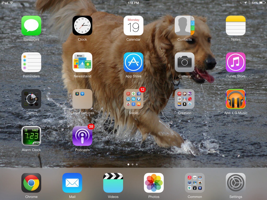
Home screen icons. They can’t be all white. White is easy to see, but it just looks uninspired just pasting that same color on all the icons. And we can’t have the icons have obvious light effects on them too, that implies that they’re some sort of metal. They also need to pop. Not white, pop out. THATS IT!! What pops out? NEON COLORS. How do we avoid the uninspired flat look? GRADIENTS!

2+2=4. Neon gradients.

Think about it. If you take out the skeuomorphic elements, what do you have left? Just colors. Make them neon to have them pop, and gradients to not make them totally flat. Voila. Ugly-ass icons.

Now how the hell did this pass under the radar of Apple’s awesome attention to detail and looks?

Precisely because of the other end of the spectrum, the “extension of the user” thing.

This is actually more simplistic than the in-app UI thing. Take the Mail icon. Physical mail comes in envelopes. So put an envelope on the icon, DUH.

Giving the icons texture will only contribute to the skeuomorphism idea, so leave the mail flat white, and THERE.

…so, you may be wondering how on God’s good earth the Videos icon ended up looking like it did.

Apparently, everything started to look too blue after the Mail icon and the App Store icon…so, what’s a color that pops? GREEN. I honestly think even an idiot can get this now.

What I can’t figure out is the Photos icon, but maybe that’s just because no one could figure out what to put there without making it look too much like something.

This is just balls-tastic, isn’t it? It’s so simple, and yet it turned out so ugly, JUST BECAUSE OF HOW SINGLE-AND DOUBLE-COLOR THINGS WORK!

I can’t even make myself type it out: There was almost NO THOUGHT GIVEN to how it would actually look!! They just said “Hey, neon. Hey, gradients. Let’s watch the flying money.” It’s SO STUPID!

That’s not to say they didn’t try AT ALL. The dynamic backgrounds actually look pretty nice.

And yes, the design may have taken a long time and Jony may have used a jewelers’s eyepiece to go over everything…but it was all for naught if he even did.

The Overall Feel of iOS 7 #ios7

20130819-133954.jpg

You notice all those blurs? The desktop background there is a picture of a dog…do you feel lighter?

Well, if you don’t, that’s pretty okay, because this design has caused SO MUCH BUTTHURT.

Look at how these icons clash:

20130819-133319.jpg

20130819-133458.jpg

That Videos icon! Dat puke green! Dat neon…drunken…shiny…shiny?…stuff…

I recently saw a few videos of people’s reactions to getting an iPhone for Christmas, and they ranged from GETTING UBER EXCITED to crying with joy.

Are they going to start crying when they see 20130819-133458.jpg?

I don’t think so. At least not with joy.

Oh and by the way to make all you people feel “better” about iOS 7, 20130819-133458.jpg20130819-133458.jpg20130819-133458.jpg20130819-133458.jpg

Make of that what you will. Good day sirs and madams.

The Completely White UI of iOS 7

Imagine you were sent to Heaven. All those white clouds, white-robed old guys with beards, golden gates and walls, and blue skies…now take out all of the gold, most of the blue, and ALL of the shadows and black and everything to do with not-pure-white colors, and you have iOS 7. And a very good excuse to have a low battery.

Well okay, it’s not ALL white, but you can really mess up your eyes if you stare at this stuff too long.

AND, also, warning, technical alert: It takes a little bit more power to display a white pixel than a black pixel. When a pixel is black it is basically off…it’s activated, but none of its red, green, or blue components are on. When a pixel is white, all three of the components are going full blast, and it takes a lot more power…but on a small scale. For a single pixel. If you scale up the number of pixels, that exponentially increases the amount of power needed. Now scale that to an iPad screen (with a Retina display), and you have a very good method of stealing power from your battery. I am at 4%. After nary a month. Less than half a month. I have no idea if it’s supposed to do that but it does.

Also iOS 7 is supposed to detect the color of your iDevice. If you have a black iDevice, the UI will be mostly black. If you have a white one the UI will be mostly white. I have a black one, and the UI is mostly…white. So far, even with the other aspects of iOS 7, I am not that impressed. Even with Control Center.

And whoever thought up the blur effect and attempted to connect that with having “a sense of your context” needs to get a life. You can have a person in front of a yellow background, and the exact same person doing the exact same thing in front of a deep red background, and you have a completely different feel, even without the blur. What context are we talking? People? There’s no people in blurs, figure that out, Apple, please!

As for where the UI is going next, I actually have a specific answer! Just turn toward the Game Center, where you tap bubbles, yes, honest-to-god single-color LIGHTED bubbles. They look exactly as if you blew bubbles with soapy water with food-coloring mixed in. Giant colored 3D bubbles. Look forward to it…maybe?

I am at 2% battery life. Time to end this before my iPad dies.

iOS 7 (Beta 5)

So…I got…early access to iOS 7. Well, okay, I stole a file from the interwebs and I can’t freaking get my developer account because I suck at money and I’m waiting on my Google Developer Console purchase so I can hopefully get enough money to actually get an Apple developer account BUT…it’s iOS 7. And it’s glassy. Well…it was. From Beta 1 to Beta 4. It’s still glassy in some spots. And it’s so simple…apparently Jony Ive thought that a TOTALLY WHITE UI provides you with a sense of nirvana or something. To me, I just always get the feeling the iPad is using more power to display all the whiteness. That and I have a black iPad, which dosen’t gel, if you catch my drift.

The glass. Why do I get the feeling that Glass = Windows 7/Vista? WHY DO I GET THE FEELING THAT A BLUR EFFECT EQUALS FROSTED GLASS. WHY DID APPLE FEEL THE NEED TO TURN METAL INTO GLASS??

And why the parallax effect? Well, it is in my Dad’s professional opinion that they are merely setting up for a total overhaul in iOS 8. You see, the parallax effect consists of a “layers” deal, wherein if you tilt the device, the layers slide underneath each other (in the case of the home screen, the icons are closer to the viewer than the background), creating this really cool 3D effect. The apps do not react to this (yet). The system messages and all message popouts (even the share sheet) do react.

So in iOS 8, what will happen is that everything going on in the phone/pad will be 3D, and the gyroscope in the iDevice will make sure not a single iota of 3D-ness is lost. Yes, the 3D home screen is coming. Get ready for Google/Yelp/Weathercube/Everything else to look f**king awesome. BUT totally white. File your complaints via the Windows Media 3D Share Sheet (Vista/7 edition) and DirectX will get back to you with a single simple sheet of white A4 legal paper.

Oh, and I can’t downgrade to iOS 6. I tried, there was a driver error, I found a video about how to fix the driver error, and that’s how I found out it was a driver error, and you needed to go into and edit the driver file, and NO. That is where I draw the line in terms of messing with Apple’s stuff. So now I’m only upgrading betas to keep the expiration date hopefully ahead of the projected release date.

What I don’t draw the line at is looking for glitches in the OS. I derive this weird joy from that. I love it when I can completely confuse the home screen on which way the device is turned. You need a pass code set. Lock the device, then turn on the screen and advance to the pass code screen, rotate the device sideways (works either direction, produces different results depending on what orientation you started in), input your pass code…and welcome to a completely screwed up home screen! Explore around! But don’t access multitasking, or that’ll reset it. In this state, the home screen is shoved toward a corner of the screen, and is cut off at various points, the blurred areas seem confused on which part of the background to grab for the effect, and the iPad/iPhone just dosen’t know how to handle itself graphically (except when zoomed into folders, everything looks okay then). Notification Center and Control Center work perfectly though, and the apps run and look okay (the zoom animation is off-center though). If you lock and unlock the device again, it either resets it completely, partially (everything looks fine, but the folder’s blur areas are still confused), or not at all. I still don’t know the criteria (I’m assuming it’s based on time).

This is for Beta 5, btw, it might be changed in later betas.

Steve Jobs: Part 3

You’re speeding on the highway, and a police car pulls you over, asking to see your drivers license, writing you a ticket, etc. What do you do?

If you answered “Wait very impatiently for the cop to finish, occasionally telling him to hurry the fuck up I’m late, then after he writes you the ticket, immediately start speeding again”…you’re wrong. But it’s what Steve Jobs would do. DID do. Possibly many times.

That is one example of the Reality Distortion Field. Be prepared to enter the Twilight Zone, because this is where things get reeeeeeaaaly iffy and weird.

Steve Jobs exercised this Distortion Field every time he was at a meeting. He would get everyone believing in an idea. For the purposes of making things at least kind of understandable, let’s use the really stupid idea of sticking a pink plastic ball on the back of the iPhone. Steve wouldn’t look twice at the idea, but just deal.

The meeting starts, Steve sits down at his silver CEO chair and starts ranting about how fun it would be to put a plastic ball on the back of the iPhone. “It’ll be pink and it would reflect the fun nature of the iPhone!” He said joyfully. His coworkers look at him as if he’s lost his mind. Then it starts. He begins piling what he calls “logic” on the idea: “The ball reflects the fun nature, pink represents serenity and that joyful kid-like feeling, and people can find their own unique way to hold the iPhone!” The rip in space-time appears: The coworkers get excited, smiles appearing on their faces. The rift expands as Jobs continues to enthuse the idea in a passionate voice, jumping around, his voice rising. The coworkers are now giving Jobs a standing ovation, clapping up a storm.

Have they all lost their minds? At the time that the rift is open, it’s really hard to say. Steve leaves the room to pursue this new idea. The coworkers are all talking about how this idea will change the way people look at iPhones and how great it will be……then the rift collapses. The coworkers start to think “wait a minute…does Steve have any idea how stupid that would look? Is it just me or can everyone see a billion problems with this? And how would the hardware design team react to this?”

The rest of it is the coworkers then try to convince Steve that it’s a horrible idea, then Steve gets mad and fires everyone in the meeting because they have instantly gone from “A players” to “B players”.

This is a bleak picture of Steve. An asshole kid who thinks the world belongs to him. But he managed to get a whole company…no, START a whole company…and amazed everyone–how does this happen?? I honestly think were it not for the Reality Distortion Field, Apple would never exist. Maybe it would for just long enough for the Apple I and Apple II to come out, but then people would’ve gone “Screw Steve, he’s an asshole”, and no one would have let him keep Apple.

Maybe you believe this is “an act of God” or “magical hocus-pocus”…and if either of those things existed (and I’m not saying they do or don’t), then maybe I would say that.

That’s for you to decide. Maybe he was abducted by aliens. Maybe there is such a thing as a part of the brain that can change other people’s thoughts. Speculation! Rumors! Arguments! Opinions! What fun!