I’m writing this in the hopes that I can dredge up some answers for myself.
Also I just learned that Apple is a functionally organized company.  This means the teams are not divided by product.  There is no iPhone team or iPad team, or even iPhone software team or Mac software team (as contradictory as that seems!).  There is only the software team and the hardware team.  Also the services team, but everyone thinks Apple should…separate that…or something.
The retail team has already been separated into basically its own company.  Even though in a company with separate teams they should already be separate.  Unless I’m missing something, like maybe that we already assumed the Mac and iOS teams were siloed off because their software is totally different from each other.  But with this new data, we can conclude that the people at Apple actually have some willpower and are siloing themselves off by themselves.  But also exchanging data about how things should work, because that makes sense </sarcasm>.
It seems like we should be trying to find out how exactly the mental models of each device are being figured out. Â I will start that now and see how far I get. Â Wish me luck:
—-
The Macintosh Mental Model
Since I’m on a Mac right now, let’s start with this.  First, the basic UI:  Every native app that docent have a specific theme has a grey gradient or color for its bars.  The buttons are also flat white with tiny little shadows.  This makes it look a lot like the hardware of the current Macs and keyboards.  The (gray) Macs are a flat color, and can have gradients if put under the right lighting, and the Magic Keyboards have white buttons that usually have tiny little shadows.
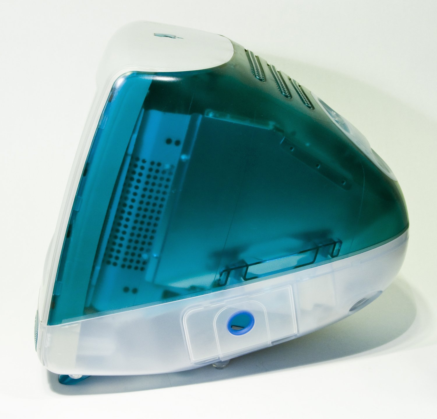
The translucent panels almost make no sense in this context, but you can find something a lot like it in the original iMac.  So the Mac mental model appears to be based on its hardware.
—-
The Apple Watch Mental Model
This one is slightly strange, in that there’s almost nothing to go off of.  The UI is entirely black, and there’s no real theming short of a few shadows, blurs, and what few onscreen colors there are (not including the home screen).  If its based off the hardware, then the home screen icons are based off of the circular Digital Crown, and all other buttons are based off the rounded rectangular…Contact-Power-Apple-Pay button.  I had to look up whether Apple Pay was activated via the side button or the Digital Crown.  Which is also a button.  In case you forgot.
If it’s not based off the hardware:  Glass/plastic floating objects.  That’s really all it looks like.  Punch me if it doesn’t.
—-
The iOS Mental Model
This one is the strangest.  Ignoring the fact that it looks lazy compared to the other OSes…the buttons have no borders.  This is a strange thing, because EVERY OTHER OS has borders for their buttons.  Most of their buttons (WHAT?!).  Since I can explain the other OSes in terms of the hardware they run on…can I explain this using the hardware?  I can hear you right now:  “No, you can’t, because the iPhone’s buttons have borders.  There are no buttons on the iPhone that don’t have any borders!”  Yeah…you’re right.  But there is text that says “iPhone” on the back that doesn’t have a border.  Yes, that sounds desperate, BUT.
There SHOULD be an explanation for this.  Like maybe Jony forced the border look into an accessibility function because…what?  Because he thought it looked too crowded?  Because everyone at Apple loved it?  Have they even seen OS X?  Maybe because that completely awkward reason in my own post?!?  Or maybe because Jony gave up??  Or he just didn’t want to design anything—
I’m sorry!  People like having borders for buttons and the reason I talked about earlier is the best I can come up with!  That, AND APPLE DIDN’T CHANGE IT FOR THREE YEARS.  CHEW ON THAT.
Okay, I’ll just shut up and continue the analysis.  But not with this OS, because plastic (flat colors) and glass (blurred panels).  The no-border buttons are text on the plastic, and no reality analogy available actually.  Except (at a stretch) for devices that have you wave your hand over a specific part of it to have it do multiple functions.  I had a DVD player that was designed that way, and it was horrible.
—-
The Apple TV Mental Model
Take iOS and OS X and slap them together, then notice that the square buttons look a lot like a TV screen, and you have tvOS’s model.
———
That’s it.  I have no answers.  I’m so sorry, both for me for wasting your time, and for you for hoping I actually had an answer.  I did tell you this was a confused post in the title.
I’m also sorry for Apple, because the software team apparently doesn’t have any idea how to…um…[insert something about the user experience here].
Except for the Mac team………………………..wait.
I’ll take a pitchfork to the gut now.